

Last month I was invited to host an Instagram photography class at KuPP in Westquay, as part of the Westquay Food Festival (to find out more about the activities, download the Westquay PLUS app, which has all the info you need about what’s coming up). While I don’t claim to be an expert in photography, I have been working in media for more than ten years, and have had my photos reprinted in books and magazines during that time – and I’ve definitely picked up some great tips along the way!
I thought I’d share some of the information I passed on during my masterclass to make a quick guide to Instagram photography – hopefully with plenty of tips to help improve your photos and help you get the results you need! I’ve decided to focus specifcally on taking photos in restaurants for this post, but I’ll follow up with tips for shots at home soon too!
Lighting
Lighting is by far the most important aspect to get right when taking your shot. My golden rule is to never, ever use flash photography on food. It looks awful, makes strange reflections, and washes the whole image out. There are going to be circumstances where you just can’t get a good shot of your plate, and no amount of experience or costly equipment will change that. I often request window seats at restaurants in order to ensure my photos will have plenty of natural light, and early evenings in summer or lunchtimes are always the best time for photos.
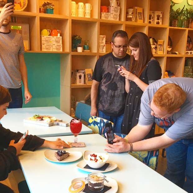
KuPP were really helpful in getting us a great set-up for the class – rearranging furniture and giving us the perfect window seats for the photos. Great food, and great hosts, too!
One of the things I was most excited about when Westquay’s Watermark expansion opened was the great lighting afforded to the restaurants thanks to the open plan layout. Rather than sitting deep inside a complex surrounded by unnatural light, Watermark’s restaurants have loads of lovely windows, meaning Instagrammers and bloggers have a great base to work from. KuPP’s interior design also had me itching to snap some great Scandi style too! Plus, there are so many options for dining in Westquay that you’ll be spoilt for choice when it comes to restaurant shots – Mexican, Brazilian, American, Scandinavian… it’s a global food extravaganza!
Even when the light is on your side, though, you need to be careful about the shadows that can be created by interior lighting. Shadows all over the plate can really kill your shots. When you’re taking a photo, try to make sure your arm, phone and hand aren’t creating shadows over your plate. If you need an extra light source, you could ask your dining partner to shine their phone’s flashlight for you, but this can have a similar effect to using flash photography. Be careful of light reflecting off of liquids like gravies and sauces.
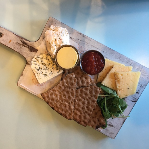
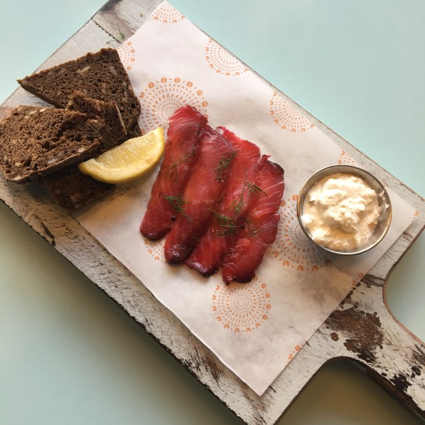
When it comes to eliminating shadows and reflections, it can sometimes be as simple as moving your plate, or changing the angle of your shot, as I did below. With no editing, this photo looks much better than the one above, because I changed the angle to get rid of the shadows that were obscuring this delicious cheeseboard! (By the way, you *have* to try their cheeses – Vasterbotten was absolutely incredible – described by the menu as being like a parmesan cheddar… I couldn’t put it better myself!)
Another thing that can help you to get a well-lit shot is to use your phone’s camera to meter off light in the image. You can do this on many phones by tapping the darkest shadow to make the entire photo lighter, or tapping on the lightest part to get more shadow.
Try to ensure HDR is turned on – High Dynamic Range processes photos differently from normal and captures greater details from the bright and dark areas of the image, giving a better colour and lighting balance.
Composition
Use the Rule of Thirds to get really interesting shots that draw the viewer in. Imagine your picture is divided into nine parts using two horizontal lines and two vertical lines. Place important elements on these lines or intersections (scroll down to the cocktail shot near the end of this post to see the rule of thirds in action). The easiest way is to place the object in the top or bottom third of the image to create ‘visual tension’. You can turn on a grid overlay for your phone’s camera to help with this when taking shots.
For iPhone: Go into “Settings,” then choose “Photos & Camera,” and toggle “Grid” on.
For Samsung Galaxy: Open the camera app, go to “Settings,” scroll and switch on the “grid lines” option.
Of course, if you’re taking a shot of a single plate, an overhead or 3/4 view with that plate centralised is going to be the most pleasing composition, but the rule of thirds comes into its own when you’re taking shots of multiple items, and using this guide can be really helpful when you’re arranging a group of items on the table top.
You should also think about which angle is the best for each dish you’re snapping. An overhead shot is great for telling a story (see the next section for what I mean by that!), whereas a straight on angle is good for a burger or sandwich, to show off the different layers. A taller item like a sundae or a cocktail is good at a 45 degree angle. Try to vary the angle you shoot from each time, because if there’s one thing I’ve learnt, it’s that you rarely take your best photo on your first attempt at a shot!

Telling a Story
When you’re composing a picture, you should have in the back of your mind what story you’re trying to tell. Adding a story to your image helps create a more interesting shot, and intrigues the viewer. Instead of taking a photo of your coffee cup, you could take a shot of the cup on the table with the bustle of the cafe behind it – telling the story of a well-deserved rest in the middle of a busy day. Or, take a snap with your hand stirring a spoon into your coffee – a great excuse to show off your nail varnish and jewellery, of course, but also a reminder that a coffee break is a little piece of luxury during the day. Think about how many more associations you can conjure in your mind with either of these mini stories, compared to just a static shot of your coffee cup.
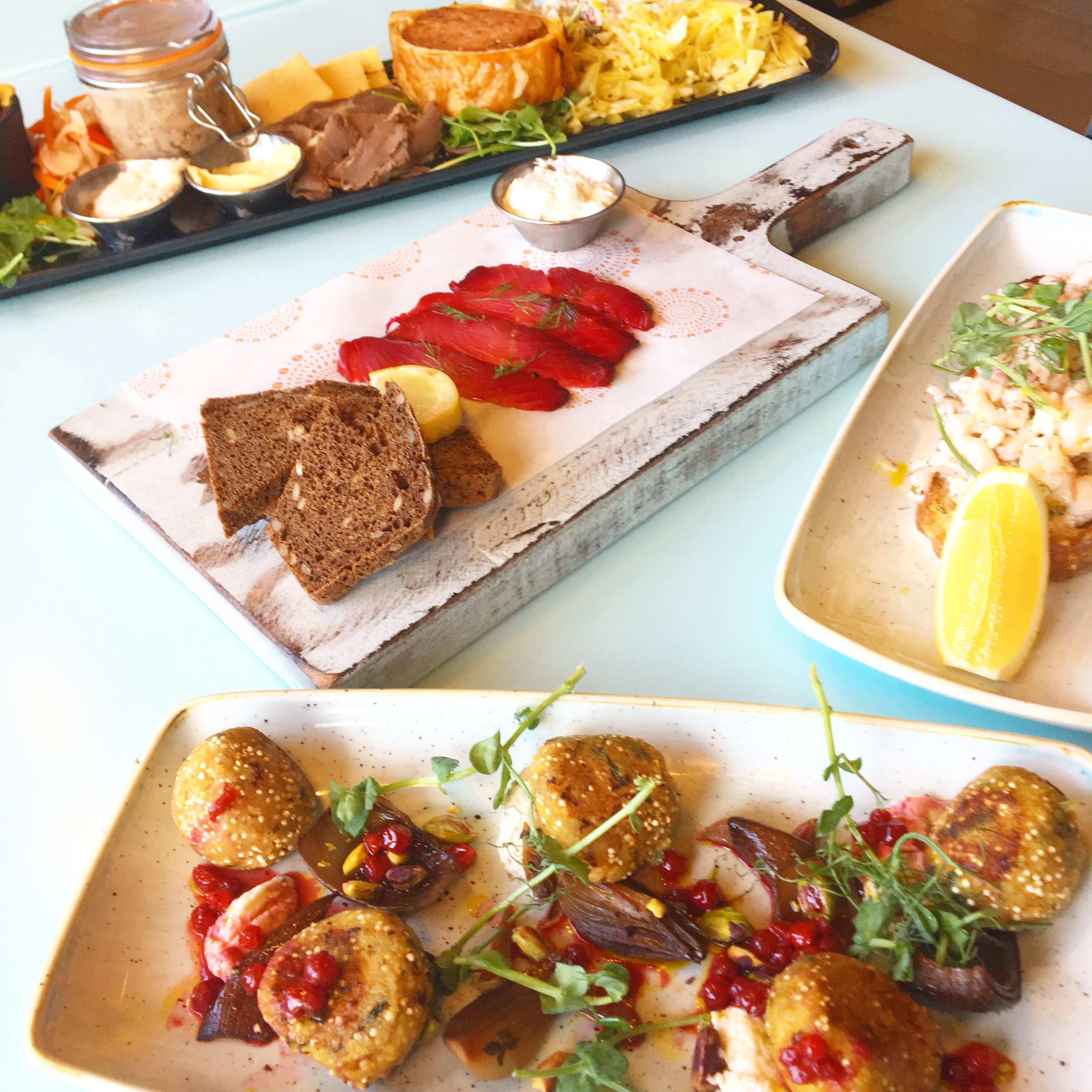
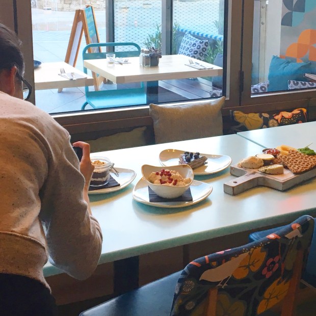
In this shot, we arranged our collection of starters together in what looks like a haphazard fashion, but one which took a while to perfect. You don’t want too much empty space, and you don’t want the arrangement to look too uniform here, either. The impression is that of a glorious, chaotic collection of platters, drawing the eye around the shot. Imagine you’ve gathered for dinner with friends and everyone is just out of the image, about to dig in… Well, that’s pretty much what happened here! (By the way, these graze and share plates were amazing, and the oven baked quinoa, kale and butternut cakes at the front of the shot were a massive surprise hit! I also have to heartily recommend the KuPP Bord at the back – a lovely spread which included potted rabbit, addictive hot smoked venison, and some gorgeous potato salad, amongst other treats!)
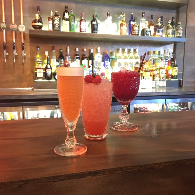
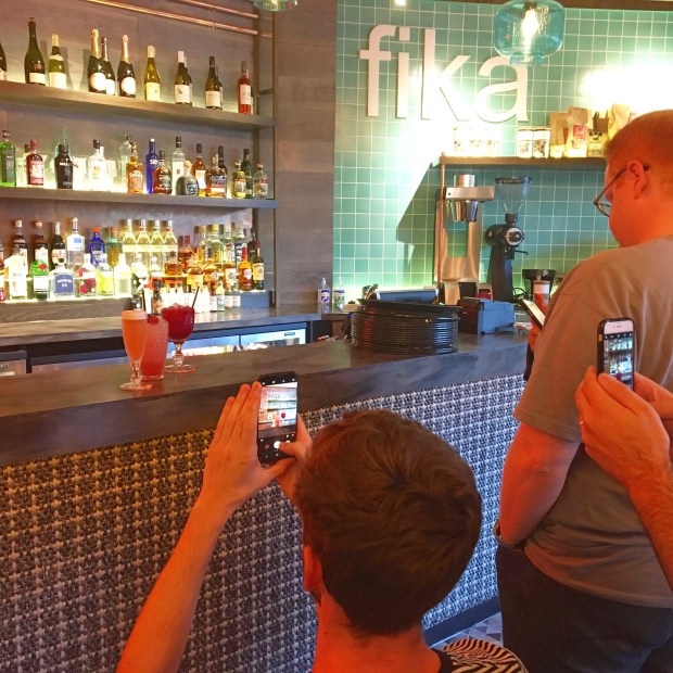
Here’s a shot of our gorgeous cocktails at the bar (the beetroot one was incredible – spicy, sweet and sour, I’ve never had anything like it before!). This is more interesting than a picture of a single glass on the table, but it can be improved…
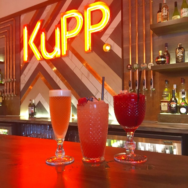
Voila – now we have a dynamic angle, the rule of thirds in effect, and KuPP’s logo in the shot too, grounding the image and giving it a story that’s even more interesting. I have one of my attendees to thank for this idea (@sunflowersinsidemysoul). She came up with the shot, and I just copied!
Create Your Own Style
There’s a lot of pressure these days to curate an Instagram feed which is completely uniform. Although this helps with branding, it can really stifle your creativity and make it difficult to work outside of your self-imposed restrictions. If you’ve limited yourself to white backgrounds only, you’ll find it hard to get any good snaps in restaurants, while if you’re a selfie queen, it can be jarring to change that up with a snap of your delicious spaghetti dish.
That said, the benefits of having a theme are clear. It helps to create your brand – what you stand for, and what makes you stand out. Some of the most popular Instagrammers have built business empires on predictable, glossy shots which always fit seemlessly into their feed. Ultimately, though, you need to decide what is more important – having the freedom to snap anything, any time, even if it’s not perfect, or curating a feed that’s exactly on theme every time.
One way that you can create your own style is to edit your photos in a uniform manner. There are always trends in photography, and especially on Instagram, and the current trend is very light, undersaturated shots with muted colours and white backgrounds. If you don’t produce shots like that, don’t despair! There’s room for everyone, and trends change. Don’t force yourself to fit into someone else’s asethetic. If you like oversaturated, colourful shots (like I do!) go for it! That’s probably the easiest way to create a feed that has some basic uniformity to it – shoot what you like, and edit it in your style. It might take you a while to decide on that style – whether it’s a specific filter, or a combination of other edits, but once you hit that sweet spot, try to be consistent with the images you take, so that people will find it easier to recognise your work in their timeline. This is my approach to the problem of how to curate my feed in a way that doesn’t limit me, but which still helps me create images that I truly think represent my aesthetic and brand.
Additional Apps
While I could do a whole post on the benefits of different apps for editing your work, I’ll just list them here briefly. Snapseed, Afterlight and VSCO Cam are all additional editing apps you can use to tweak your photos outside of Instagram, giving you more control over your edits, which also might help you develop a look that makes you stand out on Instagram. By far and away the most useful additional app I have, though, is Facetune. This is my secret to getting perfectly white backgrounds, and it really helps to make a photo pop. Simply open a photo in Facetune and use the ‘whiten’ tool. Now just run your finger along the areas of grey which need to be lightened, and hey presto! Sometimes you’ll need to save and reopen the photo to get it completely white, but it’s a great help when your lighting is poor. Don’t forget to make sure you brighten the subject of the photo as well, though, or your edit will look very jarring and unnatural.

Finally: Be Bold
My closing suggestion is to be bold with your photography. Try new stuff. New angles, new filters, new hashtags, new subjects, new backgrounds. See what other people are doing and make new ideas your own. And above all, like I told the attendees at my class, don’t be afraid of taking photos. As long as you’re not inconveniencing other people, or getting in the way, or spoiling the ambiance with your flash (which you won’t be doing, right? You promise?), there’s no need to feel embarrassed or inhibited when you take photos. Yes, it’s a blogger cliche and everyone likes to joke about their feeds being full of photos of someone else’s dinner, but why let that put you off? If we all listened to the critics no one would ever be allowed to take photos of their dinner, their baby, or their pets again, and that’d make for a pretty boring feed, if you ask me… Plus, check out this delicious Swedish pancake stack I had – it was bloody delicious and I just have to share.

To find out more about Westquay and Watermark, head to the website, here. Download the Westquay PLUS app for more about the food festival (and for discounts, activities and info all year round!), and visit KuPP’s site here to feast your eyes on their glorious menu!
This post contains sponsored content. As usual, all photography, words, and opinions are my own.

This article is such a gem! So nice to have some simple suggestions all in one place. Somehow when I get up the gumption to research taking better photos, I get mired in articles that are much to advanced for me. Thanks so much for the resource!
LikeLike
So glad it’s helpful! Some of these tips are really basic, but they make a big difference to the finished shot!
LikeLike